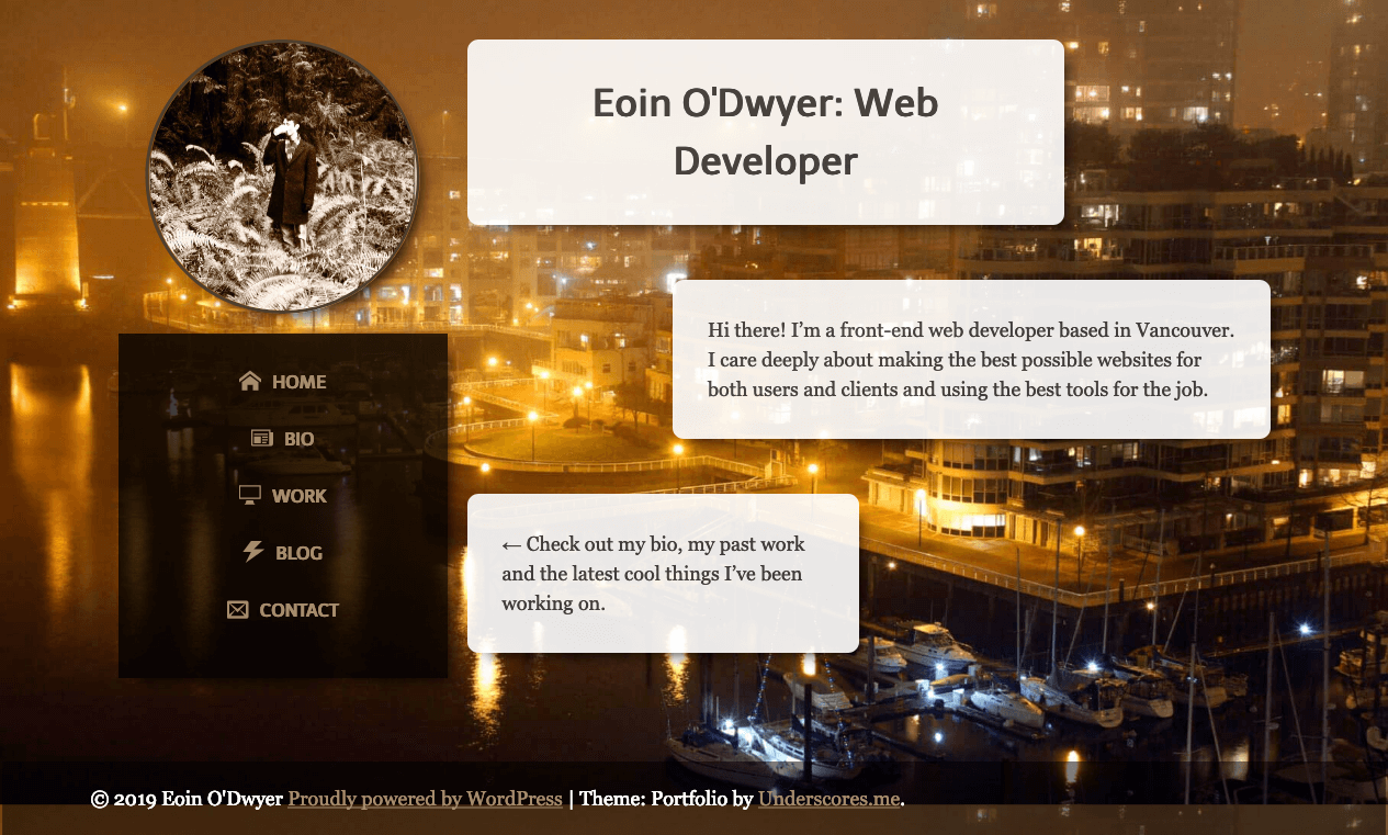
I launched this WordPress based version of my website in 2017 or so. Recently I went back and looked at the source code and recoiled in horror, as one usually does when viewing older projects. This made me think it might be time to do a little spring cleaning, so I went and tried to improve some of the problem spots.
I’d been using the Bourbon/Neat SCSS library as a helpful way to add in a grid system and other nice things without all the classes that Bootstrap and other frameworks force you to add to your HTML. These days with CSS grid, however, the need for a grid system isn’t really there as now we have a real standard for creating layout. In addition, the library added a lot of unnecessary complexity to what is a relatively simple site. So out it went.
At my new position at Venture Media, I’ve had a chance to work with enforced coding standards. This has made me think a lot more about how I organize and write my CSS. If I was starting from scratch, I’d probably try to go with a proper BEM or SMACSS system and throw in some linting for cleanness. Rewriting everything seemed a bit of overkill, so instead I went and split everything into partials, where previously I dumped most defaults into a large _theme.scss file. I switched to spaces instead of tabs for files (shortly after watching the relevant Silicon Valley episode) as previously I had unfortunately set my tab-size to 8 so everything looked rather dreadful.
I think my previous arrangement was heavily influenced by my experience working in an agency for so long. For smaller projects, especially if you’re switching rapidly between various ones, I think it makes sense to keep most of the styles in one sheet, as the sheet can then map more or less to the structure of the page (header styles, followed by general layout and sidenav and then footer). I’m trying to aim for more modular and repeatable styles for my code, however, so that’s a system I’m going to abandon.
The other big change was the homepage. I thought it would be fun to use CSS grid to create a non-standard layout, so after playing with it for a little while, I came up with the arrangement below. I’m not a great designer, but with the animations thrown in, I think it’s a fun update:

Of course updating made me realize that my npm packages were out of date, but an hour of attempting updates made me realize that switching to Gulp 4 was going to be a battle for another day.

