I updated my site WordPress theme a few years ago, and then I completely neglected to write anything about it. So here is that very delayed recap of the front-end changes made.
Base Theme
For the base theme, I went with Underscores, which I’ve basically been using forever. It has all the basic functionality for WordPress theme while keeping everything minimalist code-wise. Highly recommend it.
Underscores also comes with several CLI commands for doing things like compiling SCSS and the like, so I can just enter npm run watch on the command line to have my SCSS compile as I’m making edits. Normally I have to rebuild whatever Grunt/Gulp/Webpack task runner I’ve created every 3 years when I update my website as various packages—or variants of SCSS—stop being supported. Now I can just update the package file from the Underscores github and rebuild everything, which is handy.
CSS Variables
As CSS variables had become widely supported by 2021, I decided to switch over to using them for this theme. In the future, I’m planning to add a theme switcher to allow visitors to switch color pallettes. At the moment, it’s just a nicer way to handle color variables.
For my naming system, I used the coolors tool to generate a pallette with human readable names. For variable assignment, I used a secondary assignment to an alphabet system. This keeps the color name declarations for the styles color independent, so switching them with a theme toggle later will won’t lead to odd naming like --color-red = blue.
:root {
  --rich-black-fogra-29: #001524;
  --ming: #2c666e;
  --amber: #ff7d00;
  --middle-blue: #90ddf0;
  --blanched-almond: #ffecd1;
  --color-alpha: var(--rich-black-fogra-29);
  --color-beta: var(--ming);
  --color-gamma: var(--amber);
  --color-delta: var(--middle-blue);
  --color-epsilon: var(--blanched-almond);
}
I haven’t completely gotten rid of SCSS variables yet, as I haven’t found a nice way to add opacity to background colors without also changing the opacity of the div content, but I’m sure I’ll find a workaround soon.
Gutenberg Editor Styling
To get the blocks in the Gutenberg editor to more closely resemble the FE output, I created a separate editor.scss file to handle styling. Declaring it in the function.php file was easy:
add_theme_support( 'editor-styles' );
add_editor_style( 'editor.css' )
And then I’m able to reuse all the base styles from my style.scss file by just calling them in the editor.scss file. Then I can add additional Gutenberg styles to overwrite the defaults that WordPress adds or to make adjustments to make the editing process easier:
/* Editor Styles */

// Import variables and mixins.
@import "abstracts/abstracts";
@import "base/base";
@import "components/content/gutenberg";
@import "components/content/post-content-card";
For instance, I’m able to make the code block above have the same background and font in the editor as in the published page, which makes writing posts a nicer experience. It also allows me to do things like add borders to groups so I can actually see where to click on them to edit, which has been a pet peeve of mine for the Gutenberg editor.

Homepage Grid
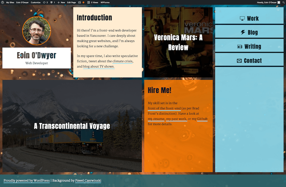
The most ambitious thing I tried to to for this new theme was to create a grid layout for the homepage that I could just add random bits of content to—including blog post excerpts—so it would resemble more of a magazine.
To get this to work, I set up a fairly simple CSS Grid for the main content area with a few breakpoints:
.home-grid {
  margin: 0;

  @include breakpoint("md-up") {
    display: grid;
    grid-auto-flow: row dense;
    grid-template-columns: repeat(2, 1fr);
    grid-gap: 1rem;
    height: 100%;
    padding: 1rem;
  }

  @include breakpoint("lg-up") {
    grid-template-columns: repeat(3, 1fr);
  }

  @include breakpoint("xxl-up") {
    grid-template-columns: repeat(4, 1fr);
  }
}
Then I added elements that I wanted to persist (branding, navigation, etc) into the content via PHP.
<div class="home-grid entry-content">
  <div class="site-branding">
    <?php the_custom_logo(); ?>
    <?php site_branding(); %>
   </div>
  <?php site_navigation(); %>
  <?php the_content(); ?>
</div><!-- .entry-content -->
Then I could just write some simple rules and use the “Additional CSS Class(es)” input for basic blocks to move individual blocks to more pleasing positions in the grid. And hey presto! This dynamic creation was born:

I’ll probably have to write a separate blog post about how I got the blog post preview cards to work using ACF and a multi-site setup, but that’s for another day. Thanks for reading!
